9 Tips to Make Your Menu Magnificent

Your menu is one of the first things your guests will interact with, which is why it’s crucial to make sure your menu makes an outstanding first impression. Your menu should reflect your concept, style and quality of food. Correctly designed menus set the expectation for the customer experience.
A poorly designed menu will detract from a guests experience, putting pressure on your food and service to make up for it. A thoughtfully designed menu that fits seamlessly with your brand, and puts an emphasis on both words and design will make your guests feel like they’ve chosen the right restaurant.
Your menu can also make a significant impact on revenue by drawing attention to profitable menu items and leaving a lasting impression with guests. While a good looking menu is important, focus on designing your menu to highlight your most profitable dishes.
These 9 menu design tips will help you make strategic decisions about how your menu should look. Get inspired, and keep in mind that your design should fit your restaurant’s individual brand and personality.
TARGET MARKET
1. Know Your Audience

Who is your customer? Are they mostly families? Are they fine diners? Students? Mostly men? Mostly Women? Vegan? Meat Eaters?
Knowing the characteristics of your customers will make it easier to design your menu to appeal to your target market.
Additionally, research shows that men and women tend to order along gender-based lines, so make sure your menu descriptions account for both preferences. Men tend to order meals that are described as being hearty and filling, while women lean toward lighter options. Crafting descriptions that appeal to both of these groups will help your menu appeal to people across the board.
Defining your target market is the first step in designing your menu.
VISUAL DESIGN
1. The Golden Triangle
Your menu is an extension of your restaurant’s brand. And while just about every customer reads your menu, you typically have their attention for a grand total of 109 seconds.
Organize your menu into categories to make it easier for guests to skim and quickly find what they’re looking for. Call out specialty items with boxes, bold text and colours, which increases the likelihood these items will be seen and ultimately ordered.
Menu engineering specialists say that our eyes typically start in the middle of a page, then move to the top right, then top left.
Consider placing high-margin dishes at the centre and upper-right corner of your menu.
2. Use White Space
Studies show that use of white space improves reader comprehension by up to 30%. If you want your menu to leave a lasting impression, plan to incorporate negative space into your menu design.
Leave some negative space to improve aesthetics and ensure your guest isn’t overwhelmed.
3. Give Visual Direction
If something’s important, highlight it! Walk your guests through your menu using design elements that put the spotlight right where they should be looking.

Use boxes, lines, and colour to attract attention to your high-margin menu items.
PRICING
How you show pricing on your menu is highly related to assessing your customer target market. Different rules apply depending on what type of dining establishment you are!
1. Say Goodbye to Dollar Signs ($)
A study at Cornell found that customers who ordered from a menu without dollar signs ($) spent significantly more than those who ordered from a traditionally priced menu. If you want to focus on the quality of your menu items ensure your menu design downplays the cost of each item.
Avoid lining prices up neatly on one side of the menu, this invites your customers to make price based decisions.
Avoid using dots or dashes, which – literally – connect the dish to a dollar amount in a customer’s mind.
Likewise, drop the dollar sign. One study found that customers opt for cheaper choices when dollar signs are used in menu prices.

Consider removing dollar signs, and don’t list prices in a single column.
2. Say Hello to Dollar Signs ($)
If low prices and great value are an important part of your marketing strategy and is what makes your restaurant stand out, use your menu to convey that message.
Highlight economic value by enlarging prices and/or highlighting combos.
MENU CONTENT
1. The Burden of Choice
A study at Bournemouth University found that there’s a sweet spot between too few and too many menu choices. Diners are already overwhelmed with choosing where to eat. Once they’ve settled on your restaurant, don’t make them sift through hundreds of options.
Customers like to see 6 items per category in fast food shops and 7-10 items for fine dining restaurants.
Match the length and options on your menu to your customers’ expectations.
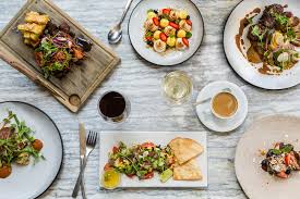
2. Carefully Select Pictures

If you choose to use pictures in your menu, make sure the photos are Instagram worthy.
Renowned menu engineer Gregg Rapp found that including a nice-looking picture alongside a food item increases sales by 30 percent.
A word of caution, though: Don’t use mediocre photos on your menu. Better to use no photos than bad photos.
Especially on digital menu boards, consider using high-quality photos of high-margin items to entice diners.
3. No Pictures? Use Imagery With Words
Use concise menu item descriptions to describe the taste of a dish. Sensory words like “savory,” “buttery,” and “crisp” elicit a visceral reaction. Give just enough to convey the restaurant’s personality and wake up your guests’ appetites.
One study found that using descriptive labels increased sales by 27 percent and improved diners’ overall attitude toward the food and restaurant.
Using highly descriptive language when copywriting your menu makes your guests feel something when they read it.